


Button, button, who's got the button?

Let’s talk about our Call to Action buttons. Because a couple of small tweaks can make a big difference to conversion rates. (Meaning, we successfully invite more people into our world to connect and share our work with.)
The clickability factor:
Your buttons should be a contrasting colour to the rest of your page. (Whether this is for your sales page, opt-in page, or shop.) It doesn’t have to be loud or obnoxious, it just needs to stand out, while remaining true to your brand palette. Even if you have a monotone brand, it might help to have a highlight colour for this purpose.
Making it look like a button can also help. It means that when our brains are scanning pages and taking in brand new information, we automatically recognise it as something we’re meant to click on. This is opposed to just underlined text, although it can look nice, it’s not as clearly clickable, and if someone is reading in a hurry they might miss it.
Make your text nice and action-y, rather than a simple ‘submit.’ Something like these but in a voice that’s right for your brand:
‘Send it my way!’
‘I’m in. Sign me up.’
‘Gimme, gimmie.’
Of course, there’s no button police, and if things are working, don’t change it for the sake of it. But if you’re finding you’re not getting as many signups you’d like, try giving these things a go and see if it helps.
Want to jazz them up even more?
Check out our Substack Button Bundle over at The Substack Soirée!
Sara and I created a free, editable batch of animated, colourful buttons that you can use in all of your Substack posts. Check them out and let me know how you go!

K x
PS if you don’t know where the ‘button, button’ line comes from, it’s here.
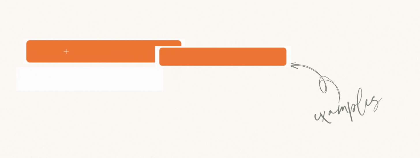
Examples:


**Ironically, we’re slightly limited at this stage with modifying our subscribe buttons here on Substack, (unless you make use of our Button Bundle!) If not though, there’s still opportunity to make the text above the button as inviting as possible. Case in point: